Conceptualizing Functionality of Your Web Site/Pages
|
-
The first step in designing a web site/web pages is to make
sure you have defined a set of goals that you
want to accomplish with your web site. Without clear
statements of purpose and objectives, your "web" project will begin
to wander off course and bog down, or may go on past the
point of diminishing returns and leaves a long-lingering
bitter taste in your mouth.
Careful planning and a
clear sense of purpose are the keys to the success in building
"meaningful and useful" web sites.
Before jumping into building your web site, you should:
- Have a statement of purpose
-- What kind of functionality do you want to
accomplish in your web site?
- Keep your goal in sight and implementable
-- What method(s) is required to accomplish your goal(s)
and how to implement/write them?
- Keep a concise outline of the information
-- Who is/are your target audience(s)?
Even though above key elements sound absolutely common-sensed, you'll be
surprised to find out how many people completely and consistently ignore
such key elements in the first place. Another well-known (and rampant)
problem in website design is that many people spend about 99% of their
times on putting "bells-and-whistles" or beautifying the appearance, not
on the content of the web site. (Yes, been there, done that) Of course,
an aesthetically pleasing webpage would increase its effectiveness,
however such effort would be pointless if there is very little or no
"content" to begin with.
Bottomline is that if you do not have the
content, don't even bother with sucking up the bandwidth and wasting
someone else's valuable time, period.
|
|
Good Design Issues - Dos and Don'ts of HTML
|
-
Try to conceptualize/organize/evaluate your resources in the first
place. Never start writing a blank HTML document first, then putting
resources later. The ONLY and
REAL value of the web is sharing and
propagating USEFUL resources with other
peoples over the net. "Bells & whistles" can always be put later on.
Now, some core bullet items on the design
aspect;
- Design the site, not pages (i.e., consistency)
- Don't rush -- Write down your design idea and
analyze it on paper till it becomes
satisfactory (i.e., "Clean-room" approach)
- Check your design from a user's perspective
- Once finalized, go for the consistency
-- virtue is in well-controlled recursions
- Do not binge on cool (and often annoying) yet proprietary
techniques -- you'll pay dearly later. Stay with well-established
standards -- that's why they're called the standard
|
Another often ignored yet crucial design element is short-
and long-term site management strategy.
Try to think about the size and number of HTML documents you'll
ended up with in six months from now. (I tell you, once started, a web site
will populate webpages like a pair of rabbits)
What would be the
best and flexible management strategy? The significance of this argument
is that if page contents are not updated promptly, it simply becomes
obsolete and useless a lot faster than you can imagine. (sounds familiar?)
Now, more core bullet
items on a desirable management strategy;
- Content is the king and the content is merely a
subjugated function of the promptness
- You're not a superman -- Assign update priorities on particular pages
- Check your content from a user's perspective, of course
- Keep asking your users what they want to see in your site
- Automate content update routines (Templates, templates, templates --
scripting with php, perl, python, etc. would be even better)
- Do not hesitate getting rid of obsolete/duplicate pages regularly --
it's painful to get rid of endeared ones, but improvement of your site
will only be realized when you make a clean break
- Don't link other sites for the heck of it unless you verify the links regularly
|
|
Now, let's take a look on specific "DO and Don't" issues item by item.
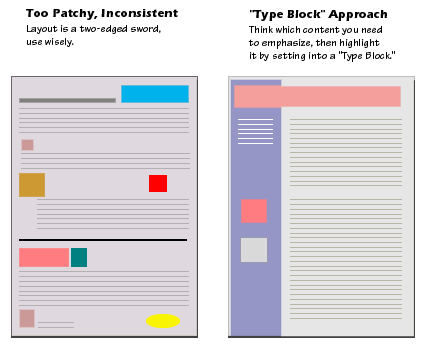
- Readers are constantly looking for sense of
context within an organization of information presented in
web pages. Most web pages don't fit completely on an standard office
15-inch display monitor, and thus there is always part of the page
that the user cannot see.
- Web pages need to give the user explicit cues to the
context and organization of information, because only a
small portion of your site (less than a page) is visible at one time.
| |
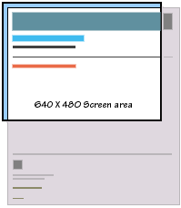
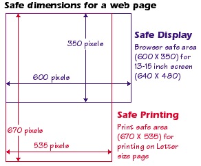
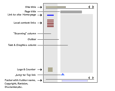
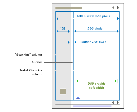
Thus, graphic "safe area"
dimensions for layouts designed to maximize
screen usage and well-printing is
-
Maximum graphic "safe area" Width = 600 pixels
Maximum graphic "safe area" Height = 350 pixels
|
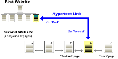
- When users click on a hypertext link in a web page, they
often are transported (or pushed) from one web site to another,
perhaps even from one continent to another.
- If your web site contains diversified contents, you do need to
provide users a clear sense of "where you are" and "where you're going."
A combination of anticipation and common logic always enhance the usability of
contents in a site.
- Provide clear and detailed labels for a hypertext link.
Graphic or iconic is a popular method of
enveloping a hypertext link. However, do not automatically
assume that users will see and instantaneously understand graphic or icon
symbology the same way as you intended. Annotation is a virtue, do exercise
whenever necessary. People do not complain on detailness but do
complain on ambiguity.
The concept of a chunk of information must be flexible, and
consistent with common sense, logical organization, and the
convenience of the users.
- Few users spend time reading long passages of text
on-screen. Most users will save long documents to disk,
or print them, rather than read extensive material online.
- One to three (printed) pages of information seems about
right for a discrete chunk of information on the web (i.e., a
single web page).
A link that produces only a small paragraph of information
would be silly in most situations.
- Concise chunks of information are better suited to the
computer screen, which provides a only limited view of long
documents. Very long web pages tend to be disorienting,
because they require the user to scroll long distances, and
to remember the organization of things that have scrolled
off-screen.

|
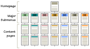
- Most "chunks" of information can and should ranked in importance,
and organized by the degree of interrelationship among units.
Once you have determined a logical set of priorities, you can build
a hierarchy from the most important or most general concepts, down
to the most specific or optional topics.
- Hierarchical organizations are virtually a necessity on the web,
because most home page-and-link schemes depend on hierarchies,
moving from the most general overview of your site (your home page),
down through submenus and content pages that become increasingly more specific.
- Most of you remember "going-round-and-round-and-I-am-completely-lost"
experiences from not-so-great and some of even well known sites.
This is called "spontaneous" branching and it is the worst aspect of the web.
The very idea of the web is sharing userful and meaningful resources
among people. Such branching would achieve the exactly the opposite.
99% time, this "spontaneous" branching is resulted from no or unclear web site
conceptualization, lack of functionality and content, and deficient
or total lack of a management strategy. Routine update will not work
very well with a site containing a lot of the "spontaneous" branchings --
of course, it can be done but with great, unnecessary pain.
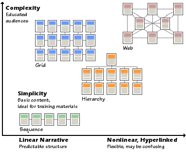
Now, let's think about four possible website organization strategies;
Sequence, Grid, Hierarchy, and Web.
 |
|
Sequence |
| |
The simplest way to organize information in a linear narrative.
Information that naturally flows as a narrative, time line, or
in logical order is ideal for sequential treatment. Sequential
ordering may be chronological, a logical series of topics
progressing from the general to the specific, or even alphabetically
sequenced, as in indexes, encyclopedias, and glossaries.
However, simple sequential organization usually only works for
smaller sites as long narrative sequences often become more complex,
and thus require more structure to remain understandable.
|
|
|
Grid |
| |
Grids are a good way to correlate variables, such as a
number of standard categories such as "events," "chapters,"
etc. To be successful, the individual units in
a grid must share a highly uniform structure of topics and subtopics.
Template is a alsolute necessity for managing grids.
|
|
|
Hierarchy |
| |
Most users are familiar with hierarchical diagrams, and find the
metaphor easy to understand as a navigational aid. A hierarchical
organization also imposes a useful discipline on your own analytical
approach to your content, as hierarchies only work well when you
have thoroughly organized your material.
|
|
|
Web |
| |
The goal is often to mimic associative thought and free flow
of ideas, where users follow their interests in a heuristic,
idiosyncratic pattern unique to each person who visits the site.
The goal is to fully exploit the web's power of linkage and
association, but web-like organization structures can just
as easily propagate confusion and fuzzy thinking about the
interrelationships of your information chunks.
|
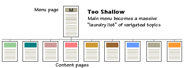
- Web sites tend to grow almost organically, and often overwhelm
what was originally a reasonable menu scheme. Web sites with a too
shallow link hierarchy depend on massive menu pages that over
time devolve into confusing "laundry lists" of unrelated information,
listed in no particular order.
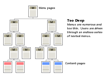
- On the other hand, unnecessary nestings will frustrate users
as well as becomes a huge management overhead. Of course, "a thousand
mile journey starts with a first step" sounds make sense, however
one step forward and two steps back would not experdite the journey neither.
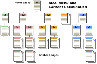
- It's all about the balancing act - you should conceptalize
the site design in the begining so that you know exactly when
to nest menus and when to propagate contents. It is Iching, indeed.

|
- All web sites are organized around a "home page" (also called "homepage"),
that acts as a point of entry (or a starting page/default page) into the
complex of web pages in your site.
The World Wide Web URI for your home page is the web "address" you
will use to point users to your web site, and the address of your home
page could become every bit as important as your street address in
the years to come.
- The top of your home page will be the first thing web users
see when accessing your site, so the proper design of home pages
is crucial to the success of your site. In a fact, the pure cruelty of the web
is that you are given one, and only one chance to make an impression to
new users, and
regardless of whether the impression was good or bad it WILL last forever.
Keep in mind that the very nature of the web is based on a "passive"
HTML medium, and no matter how useful and gorgeous your
site might be, users still have to access it "actively" to realize.

|

|
- Actual data transmission rates will vary, depending on
the type of network speed, the speed of the web server, and other
factors, but the overall point is clear; the more graphics
you use, the longer users will have to wait to
see your page.
- A full-screen graphic on your home page, plus
background graphics could leave slow network-based users twiddling
their thumbs for a full minute or more, even if they have a
state-of-the-art computer and good Internet connections.
Look at your watch (or better yet, hold your breath) for a
full minute, then figure out if that is the first thing you
are willing to ask your users to do when they visit your web site.
- Everyone has own opinion on the "best" web page format,
and I don't blame you. However, following web page format
and elements have been generally accepted as a most
effective and
"ironed-out" version.
Hey, you can always make variations of
your own from it, and most of all, you need to start from
somewhere.
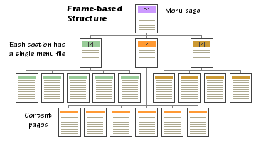
- Frames allow you to display multiple HTML documents on
a single page. There are quite a number of practical uses
for this functionality. However, frames-based pages behave
differently than regular pages because frame-based documents
are not HTML documents, but rather "meta" documents which
call and display HTML documents. Thus be careful if you're
thinking about using frames -
What You See is Not Always What You Get.
- Frames-based approach can go to two totally opposite directions
as long as site management is concerned. Depending on your
conceptualization, frames can be your best friend or worst
nightmare.

|
- At least, all web browsers support both GIF (CompuServe Graphics Interchange Format)
and JPEG (Joint Photographic Experts Group)
graphics in a webpage. You can use either graphic format for
the visual elements of your webpages. However, in practice
most web developers will continue to favor the GIF format
for most page design elements, and choose the JPEG format
mostly for photographs, complex "photographic" illustrations.
|
|
Advantages of GIF File Format |
| |
- The most widely supported graphics format on the Web
- GIFs of diagrammatic images look better than JPEGs.
- GIF supports transparency and interlacing.
- If you need to reduce the color of a complex JPEG to max. of 256.
|
|
|
Advantages of JPEG File Format |
| |
- Delivers excellent results in most photographic images.
- Supports full-color images (24-bit "true color" images).
- Supports multiple layers for creating a composite image.
- Huge compression ratios are possible, for faster download speeds.
|

|
- The GIF graphic format was developed to optimize
the transmission of image data over networks.
To keep file sizes small, the designers of GIF limited
the maximum possible number of colors in a GIF image to
256. Images limited to 256 colors are also referred
to as "8-bit images",
and may also be called "indexed
color" images. "8-bit" refers to the number of memory
bits assigned to each pixel in the GIF image. Each digital
bit can only be a "1" or a "0," so with eight bits of
memory allocated to each pixel there can only be 256
(2 to the eighth power) possible unique combinations of
"0's" and "1's." "Indexed color" refers to the 256-color
index palette that each image draws its colors from.
- Normally when you convert a full-color image into a
GIF you allow the graphics program to choose the 256
colors that best fit that particular image. This results
in the optimal GIF image quality, but it does have some
drawbacks. The problem shows up when two or more
custom-colored GIFs (that could make 512 different
colors altogether) need to be on the screen at the
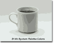
same time on a computer display that can only show 256
colors simultaneously (an 8-bit display). If the user
accessing your page only has a monitor that shows 256
colors at one time (like most SVGA and older Macintosh
color displays), then the colors in your GIF images
will look distorted.
- Forcing a GIF made from custom palette colors
(see below) to display within the limited
system palette colors often results in ugly distortions
of the image. A web browser running on an 8-bit
display has no way of optimizing your particular
custom GIF colors it just uses simple logic to force
the picture to display in the nearest equivalent
colors in the system palette. The result is often
color banding, or harsh distortions of the original
colors. (see below)

|
- Animation should be meaningful, not distracting.
Ideally, it should add the right amount of pizzazz to
the content of your page. But be sure to keep the file
size modest. What it definitely should not do is disrupt
your reader's concentration with needless chatter.
Requiring a lengthy download right at the start of
your site will lose all but the most committed viewers.
Remember, putting too many animations or special effects
is the same thing as putting too much makeups.

|
When writing HTML documents/scripts, you'd consider
following common "good programming" practices.
Of course, if you
only use one of "web authoring" softwares to create web
pages, following will not be applicable though.
- Try to put as many comments as possible for yourself
and some poor souls trying to figuring out your HTML.
They won't slow
down the loading or execution of your HTML documents.
- Try to make your HTML documents structured/modular.
This makes HTML document more understandable.
Be generous with space/additional line. They won't slow
down the loading or execution of your HTML documents.
- Try to use UPPER CHARACTERS for all HTML tags and
lower characters for the body of text. This makes HTML
document more readable, both for yourself and others, and
help you to locate possible errors.
|